EKKO
Redesign / Branding / Roll-Out
Ekko is a re imagining of a popular streaming platform designed to empower artists and reconnect with music’s rebellious spirit. The target audience are members of Gen Z who value authenticity and want to support their favorite artists without any middlemen.
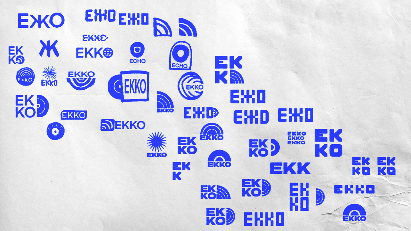
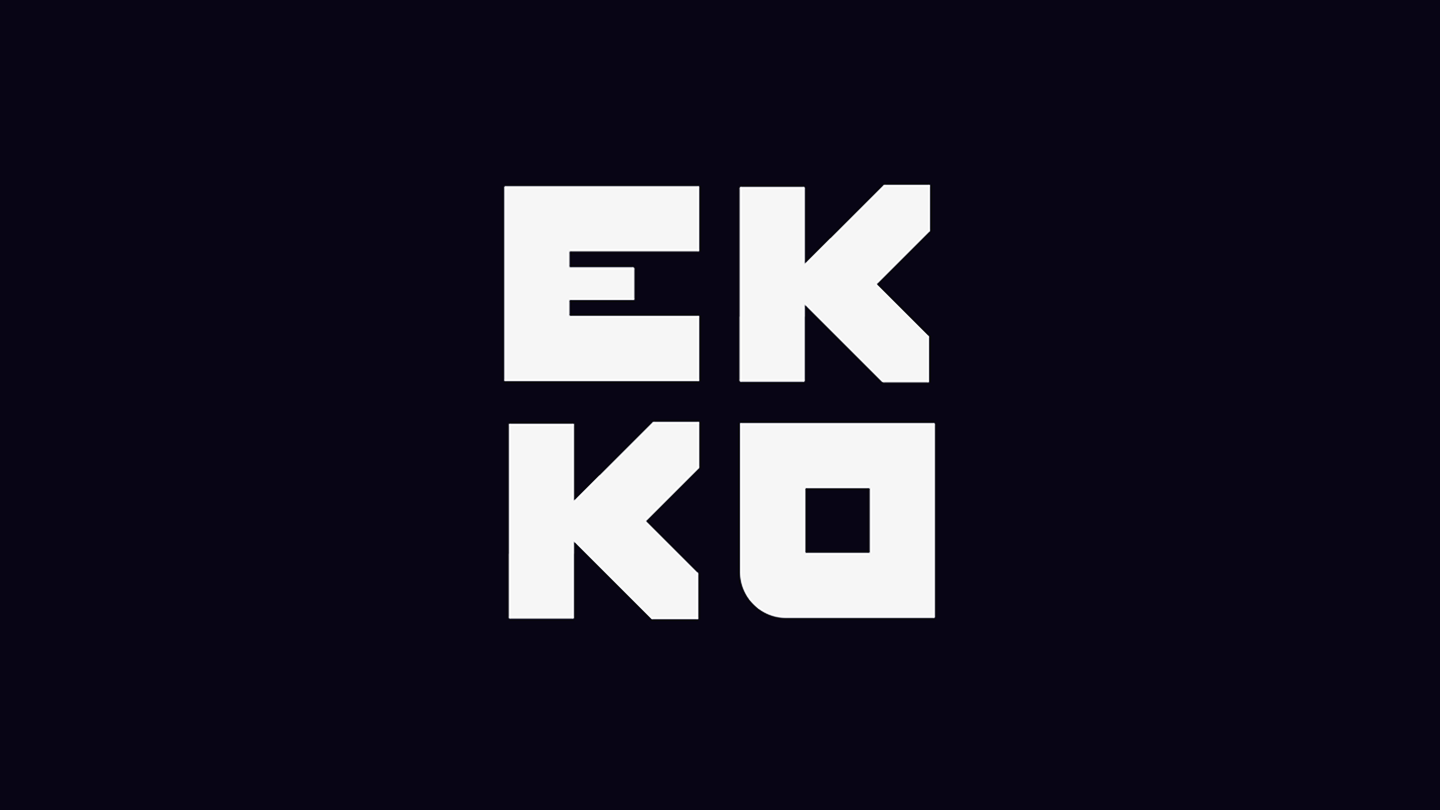

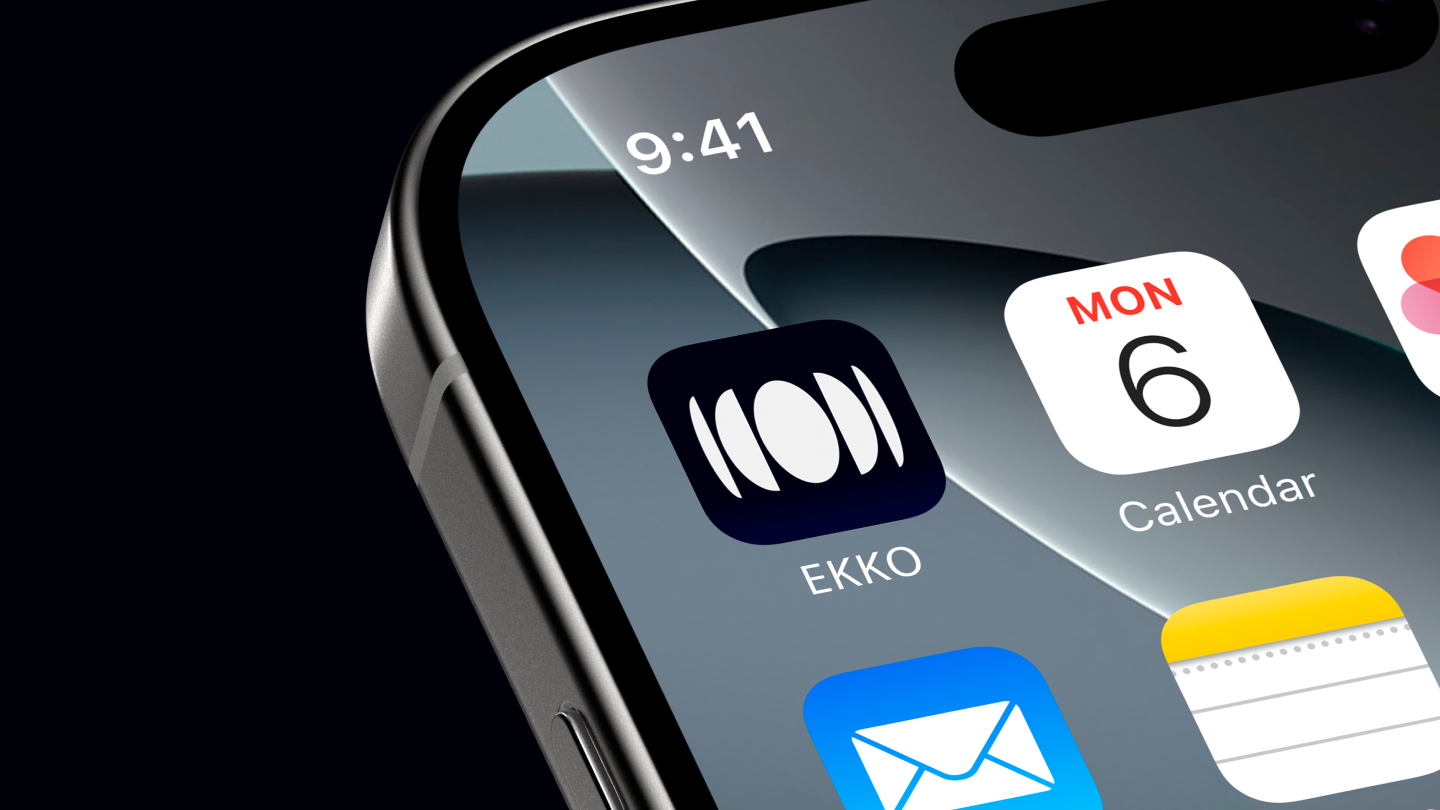
Logo / Wordmark
The wordmark and logo were designed to evoke vintage record labels. The square format ensures versatility, working seamlessly at any scale without overpowering other elements. It is perfectly square so it would look good on various forms of rollout without distracting too much from the rest of the design.
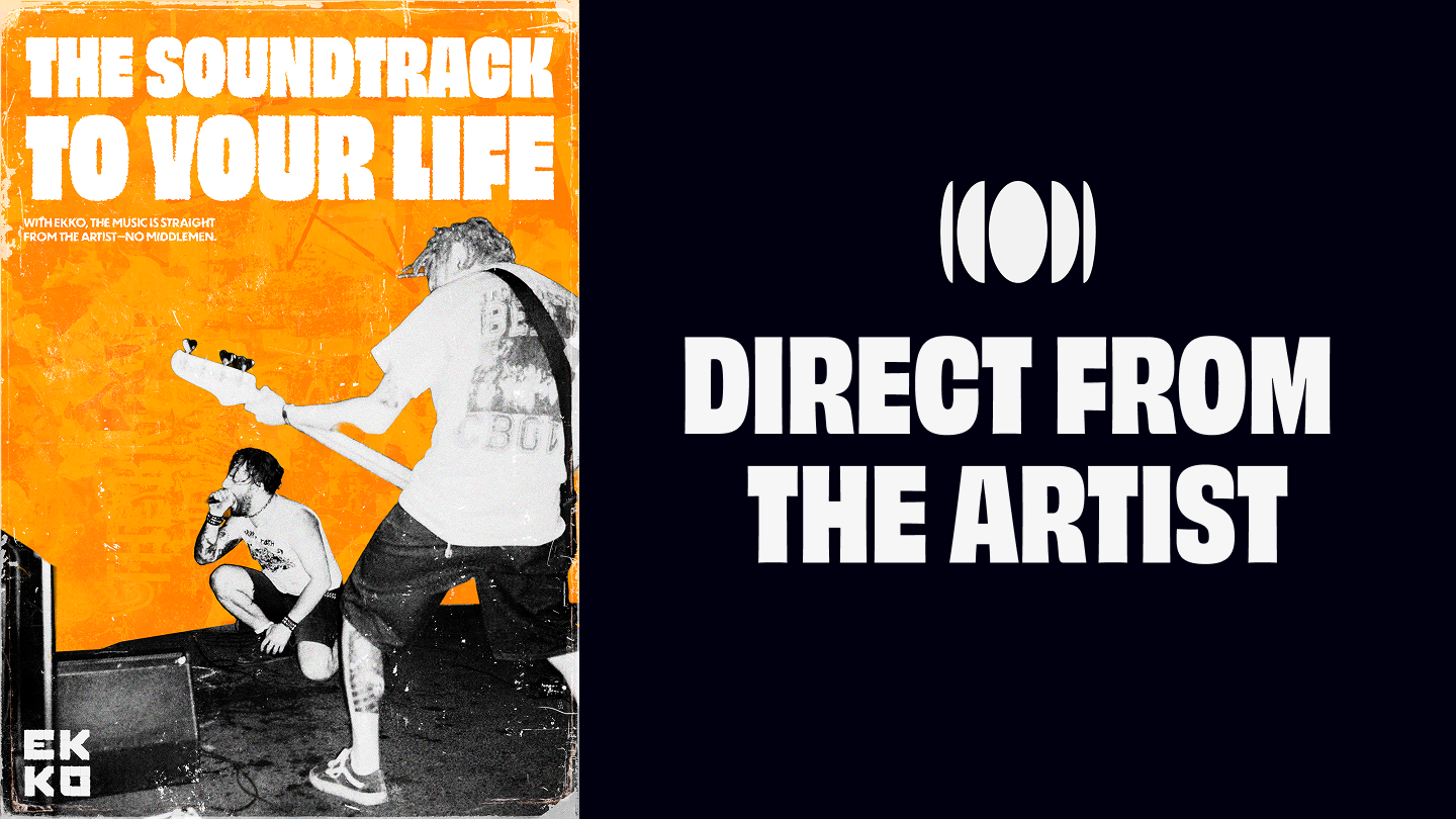
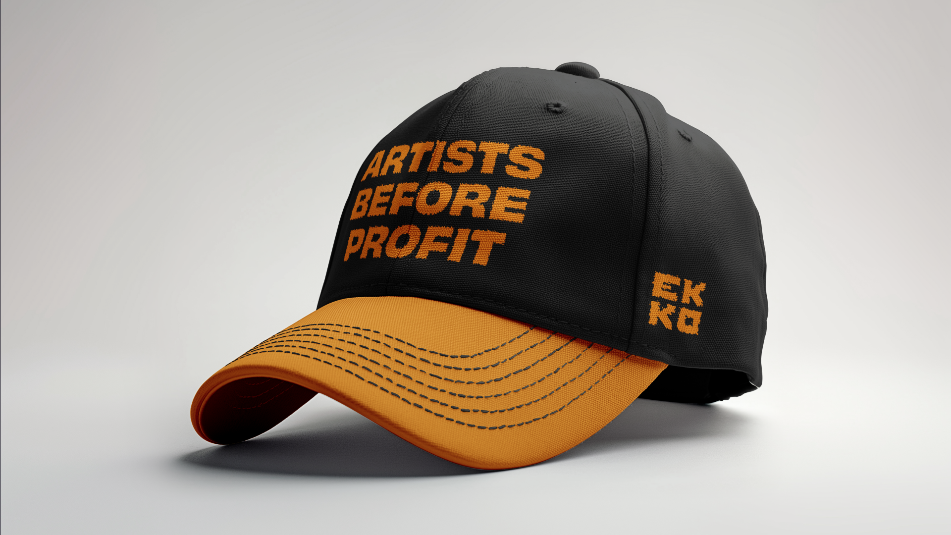
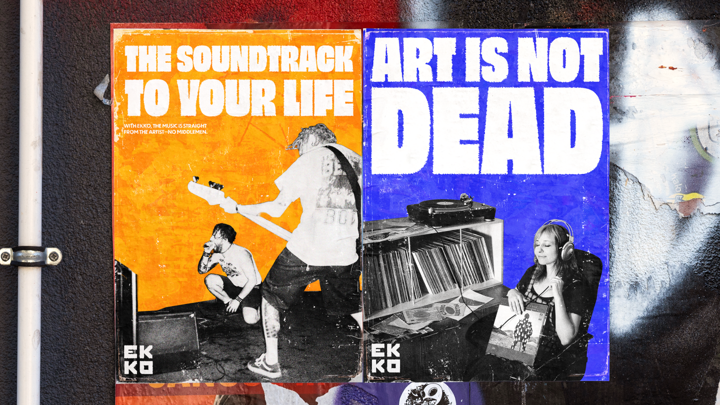
Visual Identity
The visual language of the brand is a gritty, texture-heavy design system, using distressed type and dynamic layouts to mirror music’s DIY roots. Color and imagery lean into high-contrast, photocopied-inspired treatments, reinforcing the anti-polished ethos and leaning into a sense of authenticity and personal connection.